
Grid Systems in Web Design Explained
Grid systems are the backbone of modern web design. They provide structure, balance, and consistency, making it easier for designers to organize content in a visually appealing and functional way. Whether you’re building a website from scratch or redesigning an existing one, understanding how grid systems work is essential for creating a well-organized layout. In this article, we’ll explain what grid systems are, how they work, and why they are so important in web design. We’ll also explore how to use them effectively to create responsive and user-friendly websites.
What is a Grid System in Web Design?
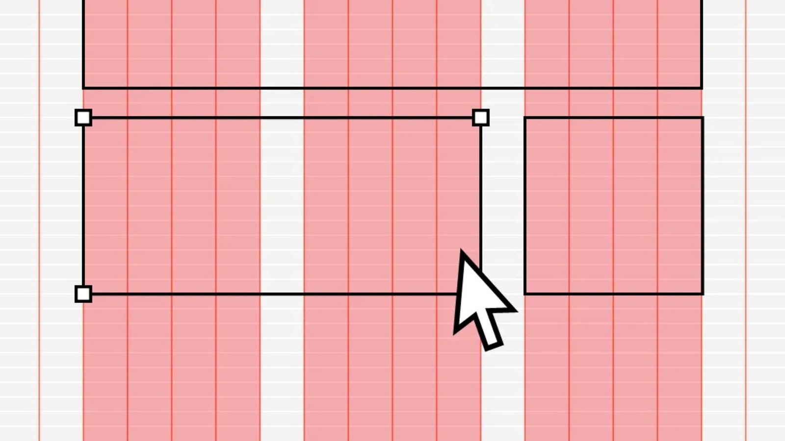
A grid system in web design is a framework that uses rows and columns to divide the space of a web page. It acts as a blueprint to help organize content in a structured manner, making it easier for both designers and developers to align elements consistently across different screen sizes.
The concept of a grid system comes from print design, where grids have been used for decades to arrange text and images in a readable, orderly way. In web design, grids serve the same purpose but also allow flexibility for responsiveness across various devices.
Key Components of a Grid System
A typical grid system consists of three main components:
- Columns: Vertical divisions of the page that organize content. Columns define how much space each element (like text, images, or videos) will take up on the page. Most grid systems are based on 12 or 16 columns, but the number can vary depending on the design needs.
- Rows: Horizontal lines that group content together within the columns. Rows help create separation between different sections of the layout, making it easier to structure the page.
- Gutters: The spaces between columns and rows. Gutters ensure that elements don’t touch each other, giving the design breathing room. These spaces are essential for creating clear divisions between content blocks.
Why are Grid Systems Important in Web Design?
1. Consistency
Grid systems help maintain consistency across pages and elements on a website. By using a structured layout, designers can create uniform spacing, alignments, and proportions, making the website look more professional and cohesive.
2. Responsive Design
Grids are a fundamental part of responsive web design. They make it easier to adjust the layout to different screen sizes, from desktop to tablet to mobile. A well-designed grid system ensures that your website will look great and function well on all devices, regardless of the screen size.
3. Efficiency in Design and Development
Grid systems provide a structured framework that allows designers to quickly organize content. Developers can use grids to code the layout in a more efficient and scalable way. This helps speed up the design and development process while minimizing errors.
4. Improved User Experience
A well-organized layout improves readability and usability, guiding the user’s eyes naturally through the content. A clean, predictable grid structure helps users navigate the page easily, which can increase engagement and reduce bounce rates.
Types of Grid Systems
There are several different types of grid systems that designers use depending on their design needs. The most common ones include:
1. Fixed-Width Grids
Fixed-width grids have a predefined width, meaning the layout remains the same size regardless of the screen size. This type of grid is often used in traditional websites with a fixed-width design.
- Pros: Simple to implement and ensures a consistent look.
- Cons: Doesn’t adapt well to different screen sizes, potentially leading to poor user experience on mobile devices.
2. Fluid Grids
Fluid grids use percentage-based widths for columns, meaning they stretch or shrink based on the size of the screen. This allows the layout to be more flexible and adapt to different screen sizes.
- Pros: More adaptable to various screen sizes.
- Cons: Requires careful planning and testing to ensure elements are displayed correctly across all devices.
3. Responsive Grids
Responsive grids combine fixed and fluid grid principles. They adjust dynamically to different screen sizes by using CSS media queries to change the layout and column sizes. This type of grid is the most commonly used in modern web design.
- Pros: Fully adaptable to all screen sizes and devices, ensuring an optimal viewing experience.
- Cons: Can be more complex to set up and maintain.
4. CSS Grid Layout
CSS Grid is a newer and more advanced method for creating grid systems. It allows designers to create both rows and columns within a grid container using CSS. CSS Grid offers much more control over the layout compared to older grid systems.
- Pros: Extremely flexible, allows for complex layouts, and provides fine control over content alignment.
- Cons: Requires a solid understanding of CSS and may not be supported on older browsers.
Business Solutions and Online Gaming
At XenexBD, users can explore innovative business solutions and digital services designed to streamline operations and enhance productivity. For a fun break from work, Jokacasino Games offers an engaging platform filled with exciting online games. Both platforms aim to deliver value and enjoyment to their users.
Conclusion
Grid systems are an essential tool in web design, offering structure and organization to your layouts. Whether you are designing a simple landing page or a complex multi-page website, using a grid system helps create a visually appealing, easy-to-navigate, and responsive site. Understanding how grid systems work and how to implement them in your web designs will not only enhance the user experience but also improve the overall effectiveness of your site.